
配色(pm3dの色)について
gnuplot ver4.6で確かめています。
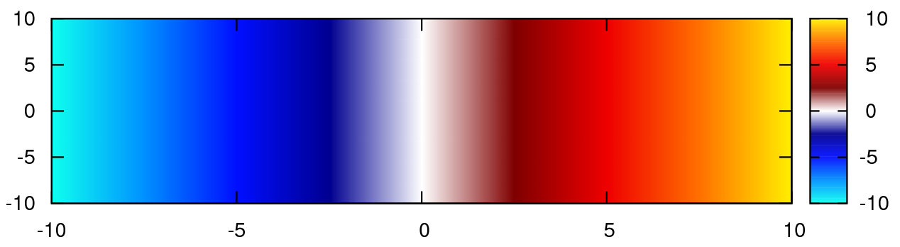
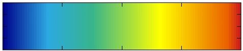
一番良いと思ったカラーマップは、matlabで使われている”jet”だと感じました。
参考:Matlab colorbar with Gnuplot
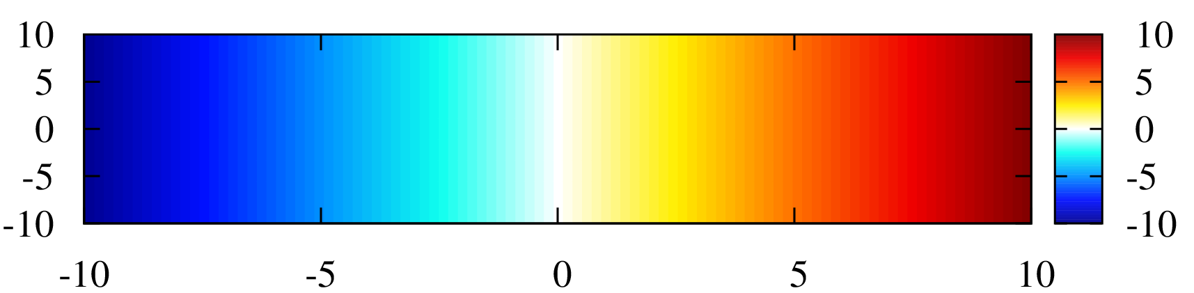
※一番下に黒または白を追加した以下の物も良いと思います。
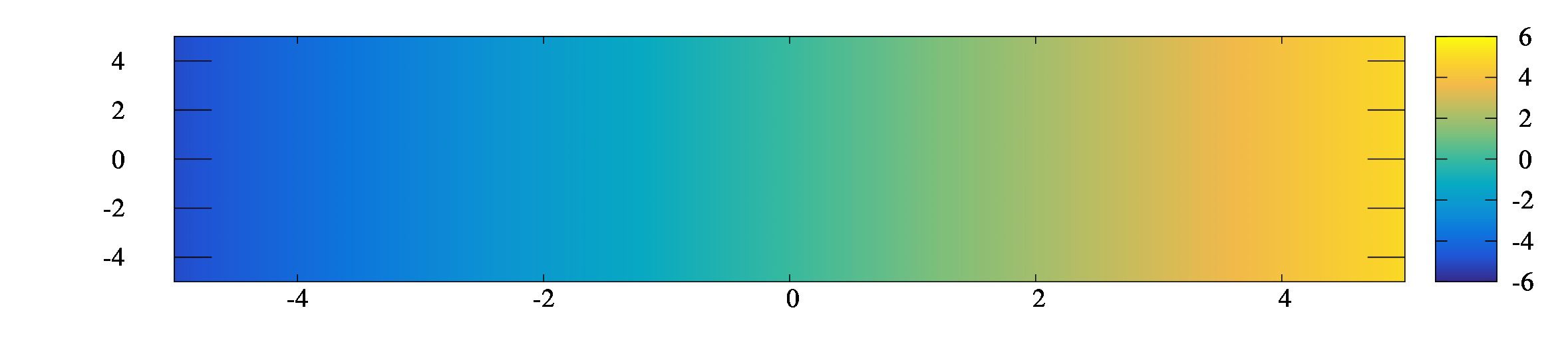
※正負をはっきりと見せたい時。
追記)2023/01/13
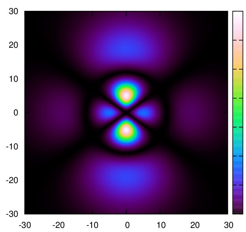
matlabでは、最近parulaというカラーマップが採用されているようです。
グレースケールにした時にも画像を変更する必要もなく、このままで綺麗に出るようです。
また、\(f(x,y)=\sin(xy)\)をjetと比較してみましょう。
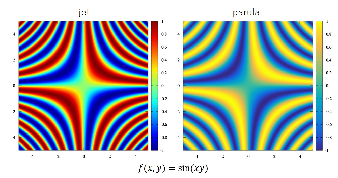
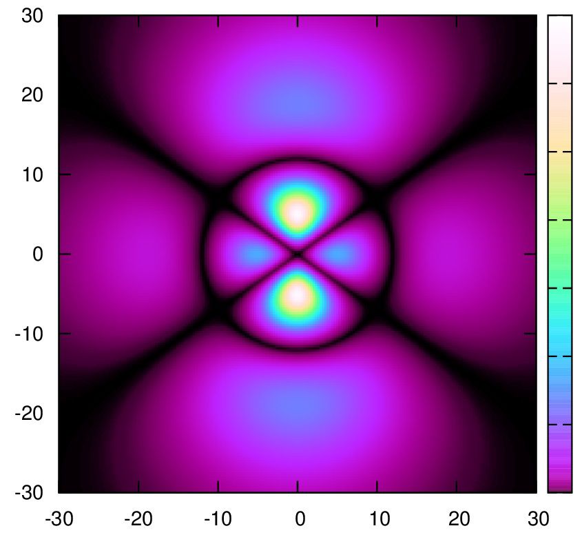
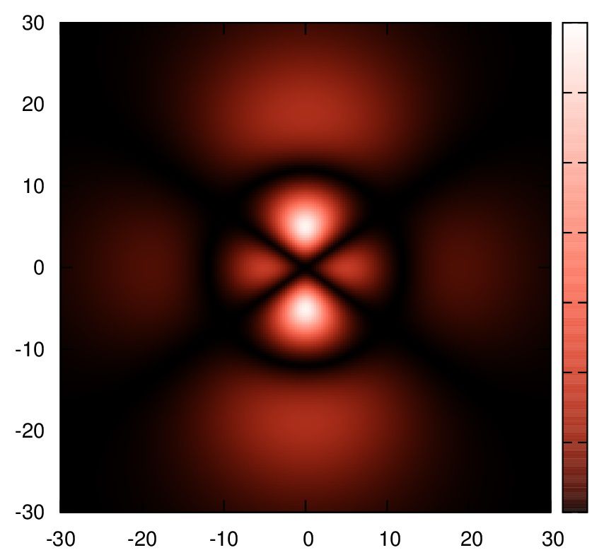
グレースケールとした場合は、以下のようになります。
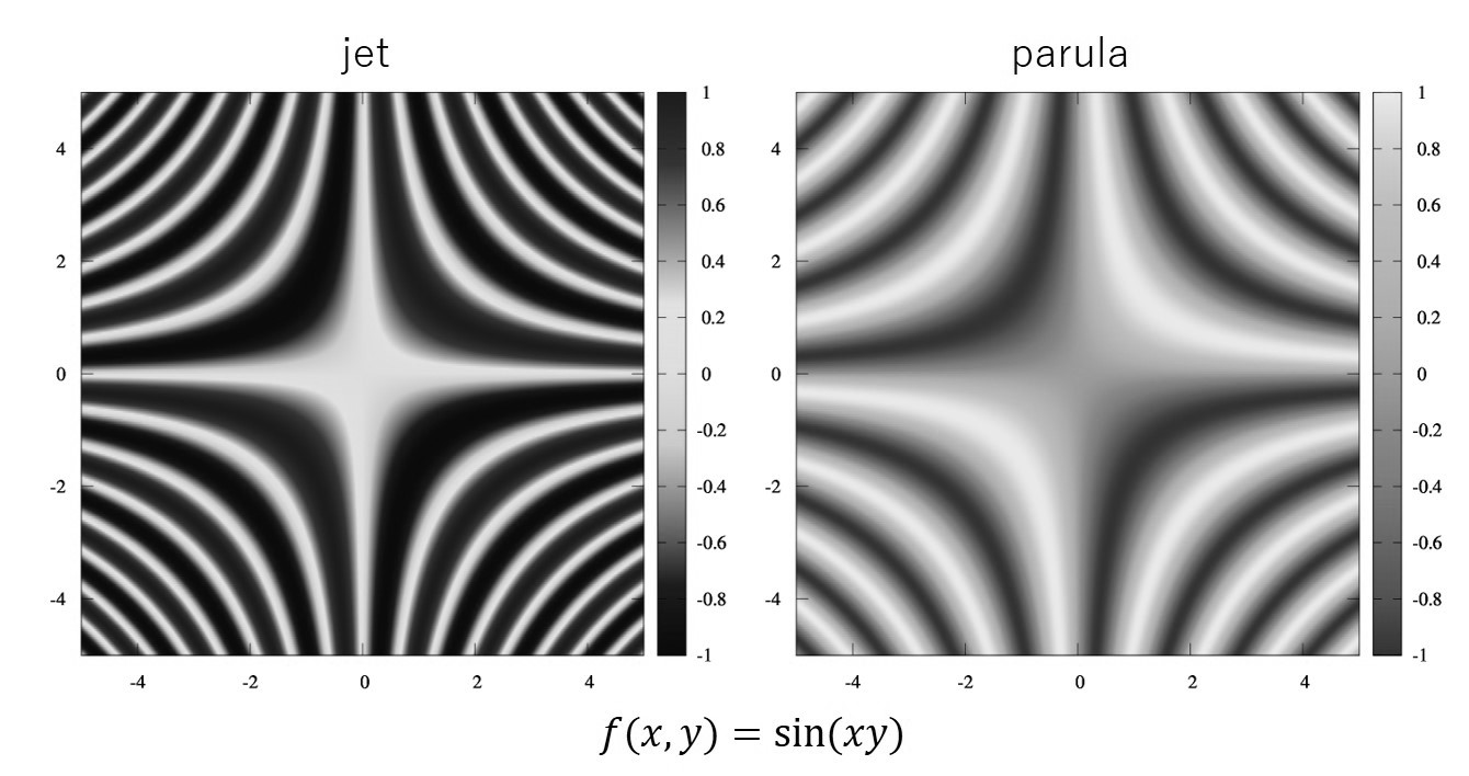
確かにparulaの方が高い低いがはっきりと分かります。
カラーの場合は偏りが生じないjetの方が綺麗ですかね?
しかし、parulaの方が柔らかな印象です。
グレースケールで印刷されることが予想されるならば、parulaの方がいいですね。
印象が大きく変わるかと思います。好きな方をご使用ください。
配色について。
gnuplotでは色の指定方法として3種類あるそうです((2),(3),(4))。
お勧めのカラーの指定順に,
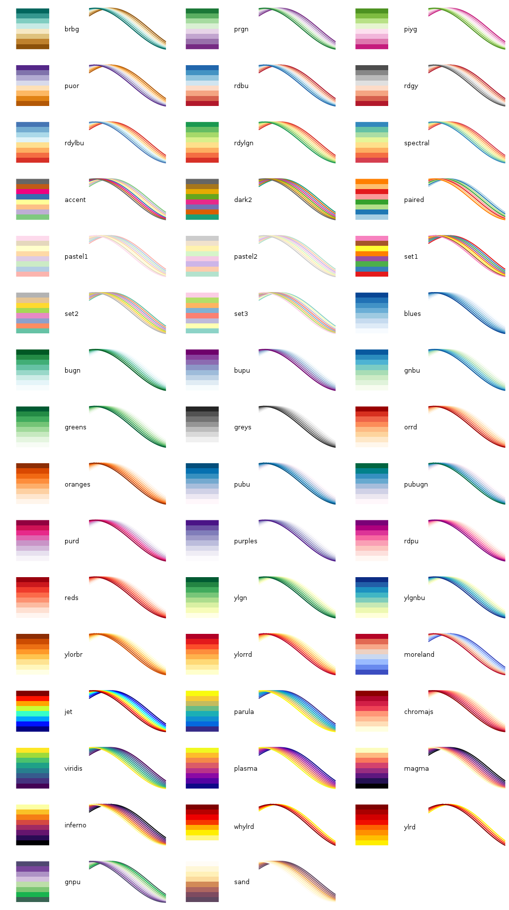
(1)外部サイトgnuplottingにあるカラーマップを利用する
(2)cubehelixで指定する
(3)definedで指定する
(4)rgbformulaeで指定する
(1)gnuplottingにあるカラーマップの利用
一番早く、綺麗なカラーマップを得るためには”gnuplotting(http://www.gnuplotting.org/)”という外部サイトに紹介されているgnuplotのカラーマップを使うことです。
ここに紹介されているカラーマップは、https://github.com/Gnuplotting/gnuplot-palettesより画像を引用して、
 ((c)gnuplotting)です。
使い方
- Gnuplotting/gnuplot-palettes -githubに飛びます。
- 右上にある “Clone or download” をクリックしてすべてのファイルをダウンロード
- カラーマップを見て使いたい名前の “***.pal” ファイルをgnuplot上でload
で使えます。線の色なども上書きされるので、もしも線の色だけを変えたければ、linestyleなどで変更する必要があります。
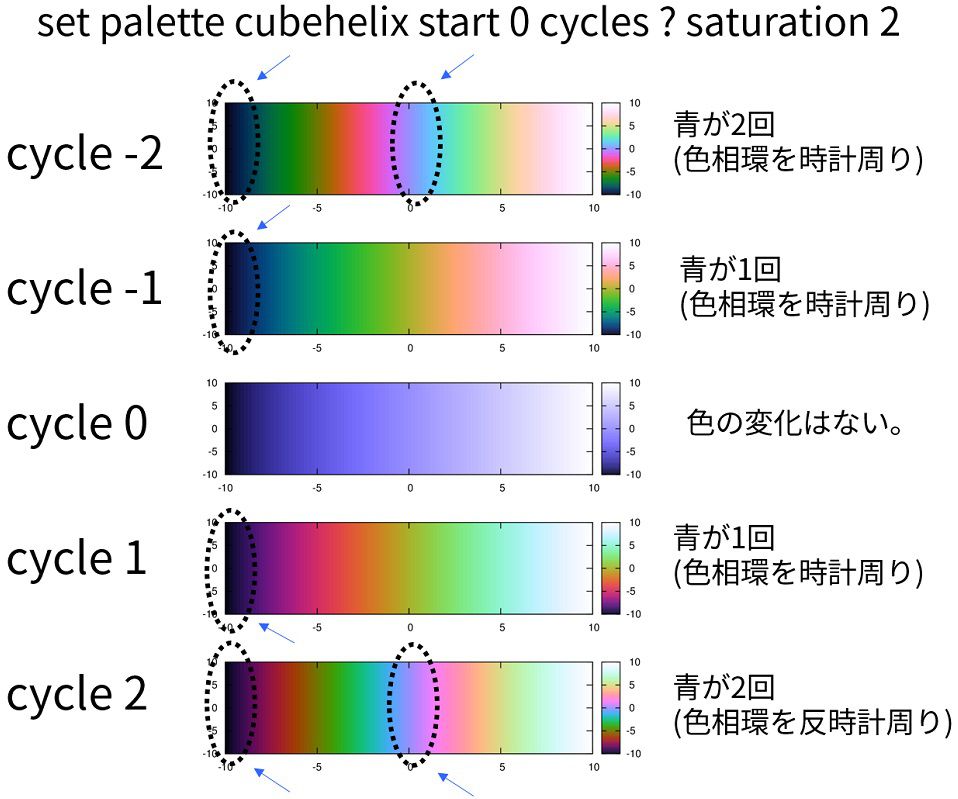
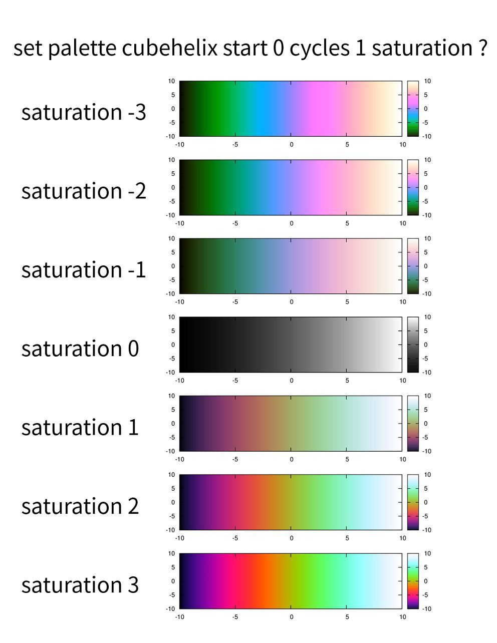
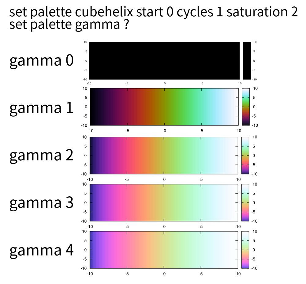
(2)cubehelixで指定する
gnuplot version4.6以上
この色の指定方法はD.A.Greenによって発表された、宇宙の、強度イメージを色付けするために作られた色の指定方法です[1]。
それぞれのパラメータが何を表すかは折りたたんでおきますので、気になる方は下のリンクを開いてください。
[adsense1]
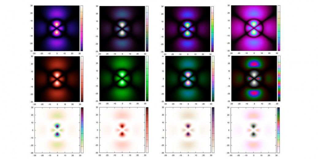
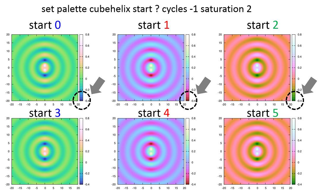
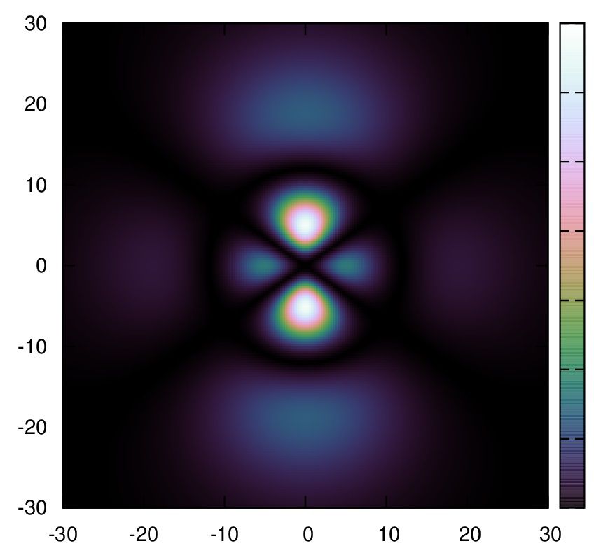
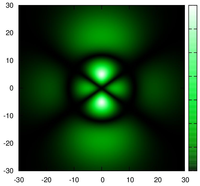
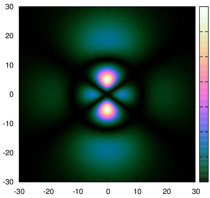
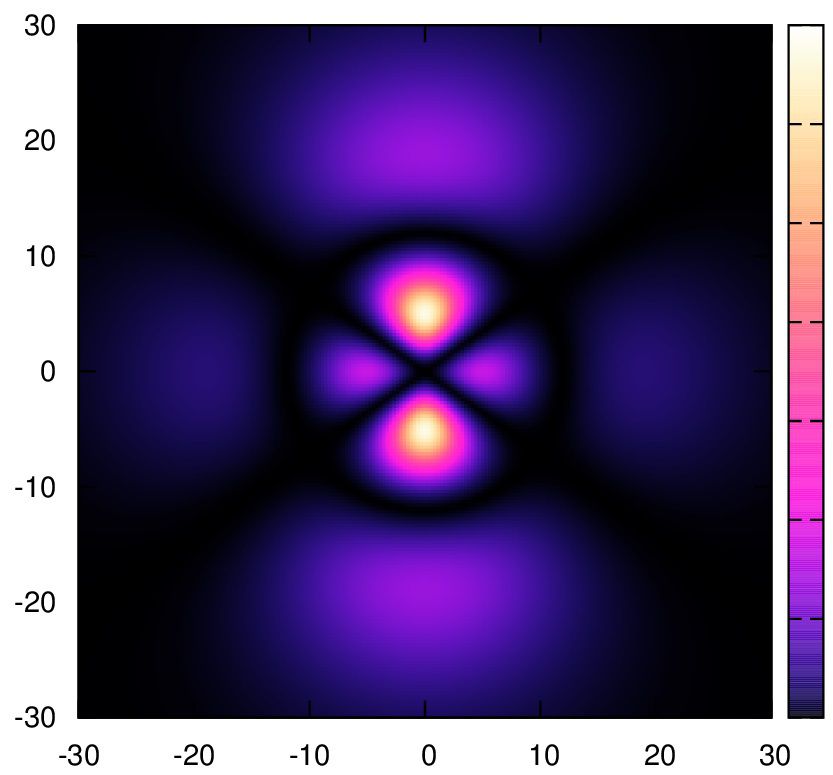
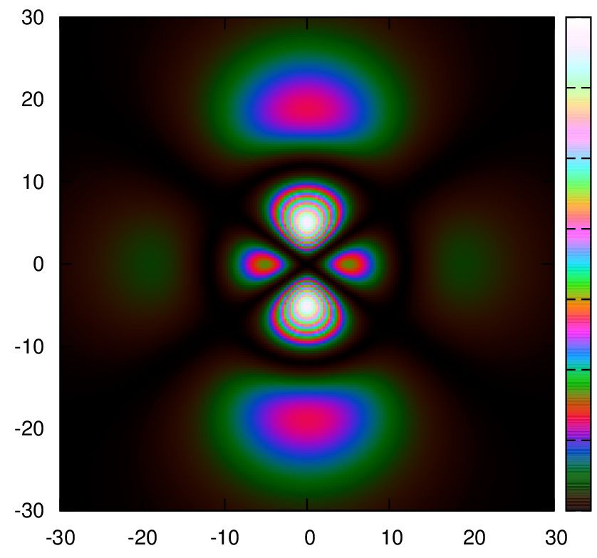
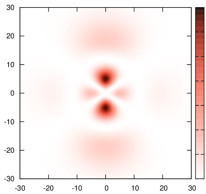
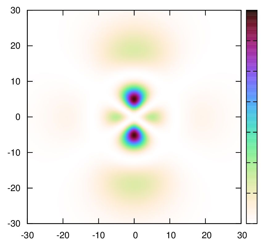
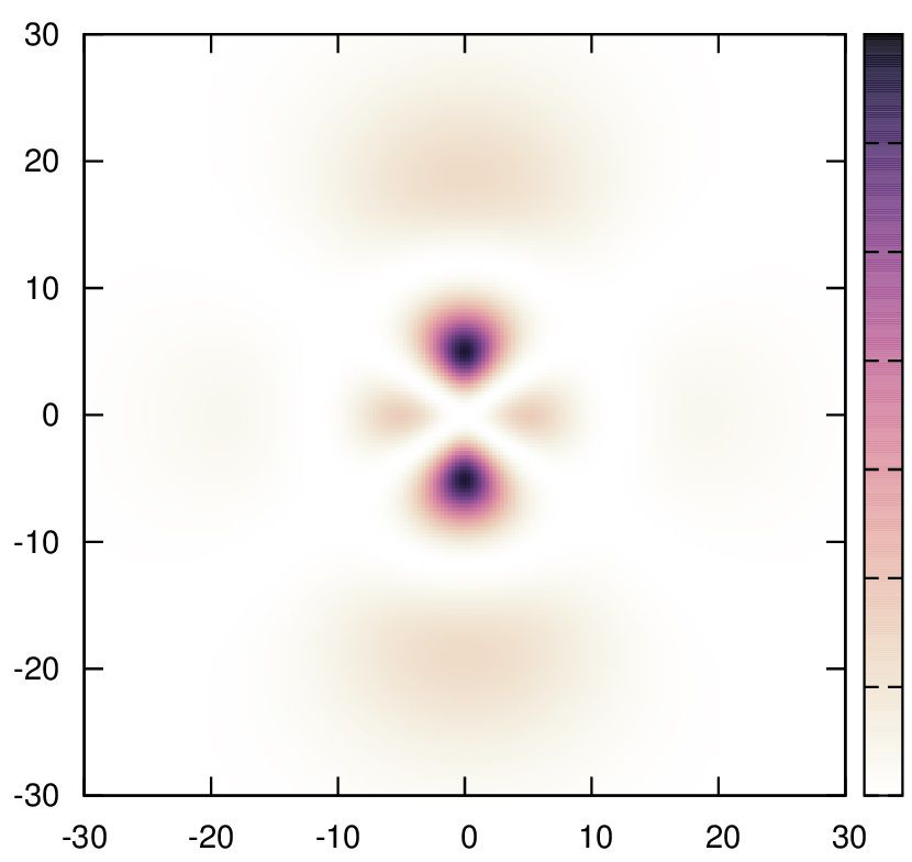
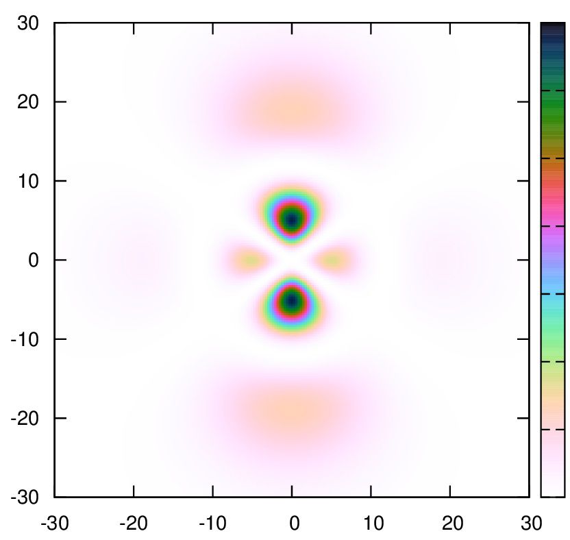
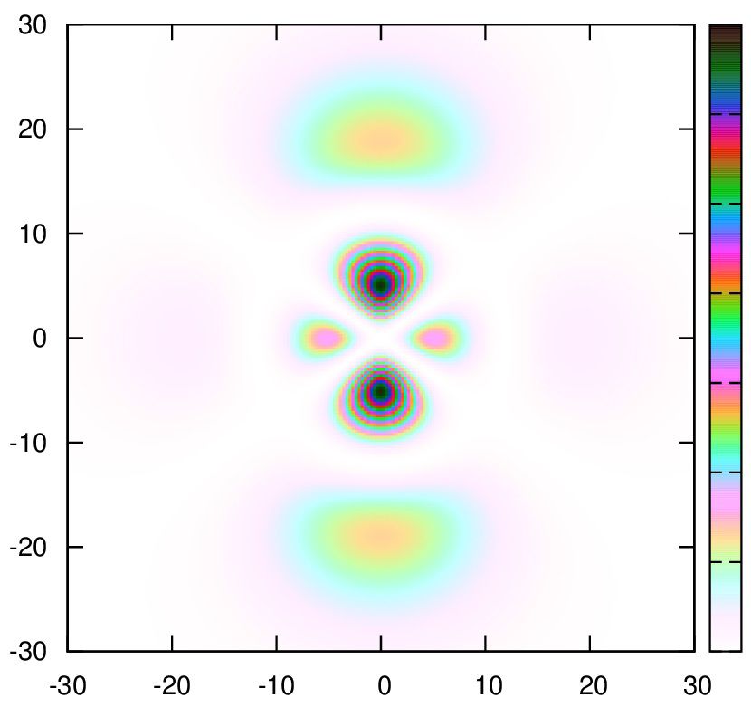
cubehelixでの具体例
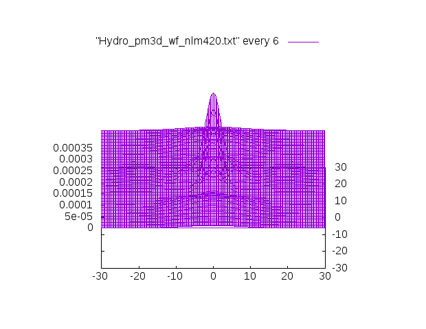
対象とするデータは、水素原子の(n,l,m)=(4,2,0)の解析解です。
※このデータが欲しい方はこちらHydrogen_xz_nlm420.txt(1.5MB)に置きましたので、コピペしてください。
Ctrl+aで全選択できます。
3Dの表示ではこういうグラフです。
特に記述が無いものはgammaの値はデフォルトの1.5です。
1.
きちんとした裏付けの下カラーリングされているので、論文等々にお勧めです。
2.
もしくは
3.
set palette gamma 3
もしくは↑に近い色で
4.
5.
6.
7.
8.
9.
10.
11.
12.
13.
(3)definedで指定する
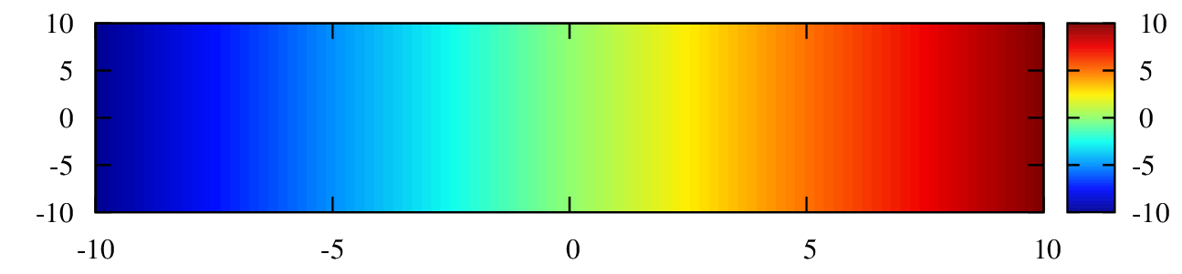
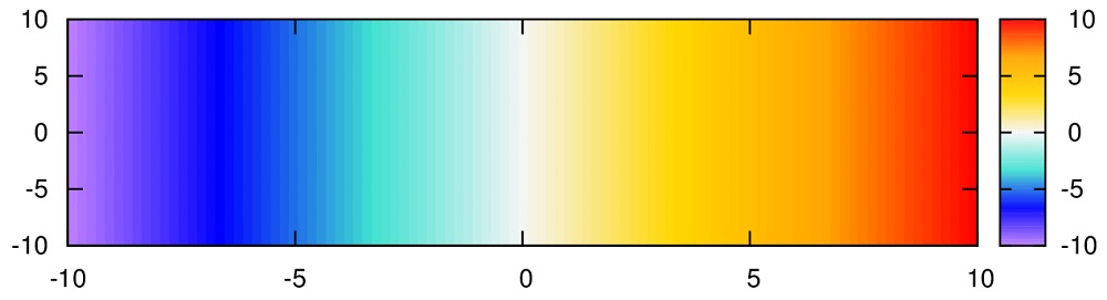
z軸が-3になったとき青色(blue)、0になったとき白(white),5になったとき赤(red)、10になったとき黄色 (yellow・になるような配色です。
zの範囲が-50 < z < 100だった場合は-3,0,5,10の比で表されます。
すなわち、z=-50で青、z=-16付近で白、z=42付近で赤、z=100で黄色となるように自動的に調整されます。
色は有名な色は上の例のように言葉で記述できますが、16進数のカラーコードによる表示もできます。
カラーマップ例
カラーマップ例を載せます。
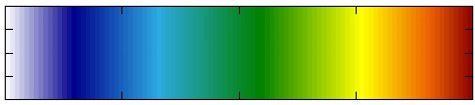
matlabで使われている”jet”のカラーマップです。
参考:Matlab colorbar with Gnuplot
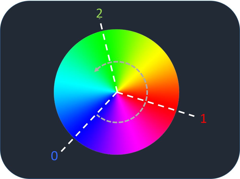
色は色相環を元に作っています。
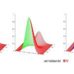
周期的な関数を出力するときに役に立ちます。例えば、リーマン面を角度に依存させて表示する際などに利用すると良いです。こんなように。
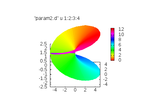
色相環を元に作成したものです。
※匿名希望さん提供
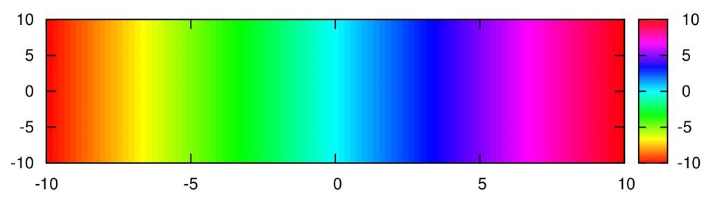
白⇒青⇒水色⇒黄色⇒オレンジ⇒赤
細かい変化を見たい時にいい感じになります。
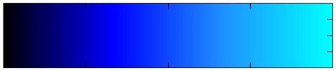
黒⇒青⇒明るい青
不連続な関数を表示させる時にこのマップを使うといい感じになります。
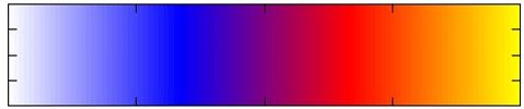
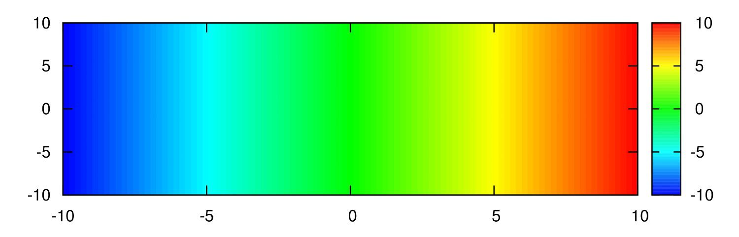
白⇒青⇒赤⇒黄
上の2つが気に入らなかったりした時に。
青⇒水色⇒黄色⇒オレンジ⇒赤
一番下が白じゃないほうがいいときに。
(4) rgbformulaeで指定する
”set palette rgbformulae” のあとの3つの整数で赤(R)/緑(G)/青(B)に対応しています。
整数で赤、緑、青をどのような変化具合をさせるのかということを指定します。
直線的に色を変化させるのか、2次、3次関数的なのかはたまたsin,cos的なのかを。どういった整数を使えばどういう関数に相当するのか?
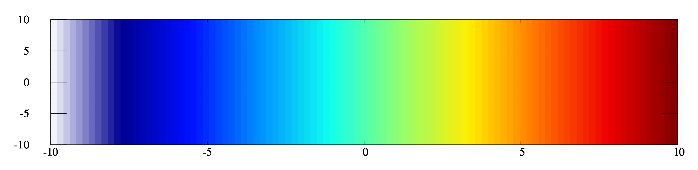
これを知るには gnuplot上で
”show palette rgbformulae”
と打ってください。gnuplot ver.4.6では、以下の画像のように出力されます。
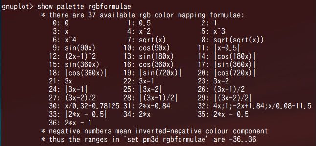
0~36まで出てきます。指定は-36~36までできます。負の値は反転することを意味しています。
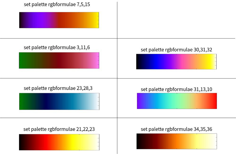
また、いくつかのrgbformulaeを使った例が ”help palette rgbformulae” で見れます。実際に入力するとこんな感じ。
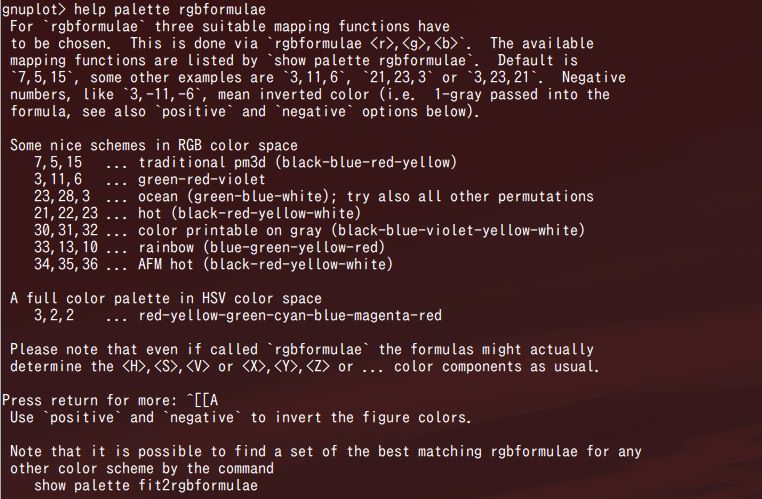
helpで現れるカラーマップはこんな感じです。
また、今使っているカラーマップをrgbformulaeで記述をしたい場合、
とやれば、今使っているカラーマップをrgbformulaeで表示する場合の3つの数字を出してくれます。
あくまで似た図です。
デフォルトのカラーマップを変更する
デフォルトのカラーマップを変更するには、ホームディレクトリにて、
.gnuplot
という名前のファイルを作り、その中に
と記述します。これでデフォルトのカラーマップが変更されます。
ちなみに、僕が使っている.gnuplotファイルは以下のものです。
#matlab jet
#set palette defined ( 0 '#000090',1 '#000fff',2 '#0090ff',3 '#0fffee',4 '#90ff70',5 '#ffee00',6 '#ff7000',7 '#ee0000',8 '#7f0000')
set palette defined ( -1 '#ffffff', 0 '#000090',1 '#000fff',2 '#0090ff',3 '#0fffee',4 '#90ff70',5 '#ffee00',6 '#ff7000',7 '#ee0000',8 '#7f0000')
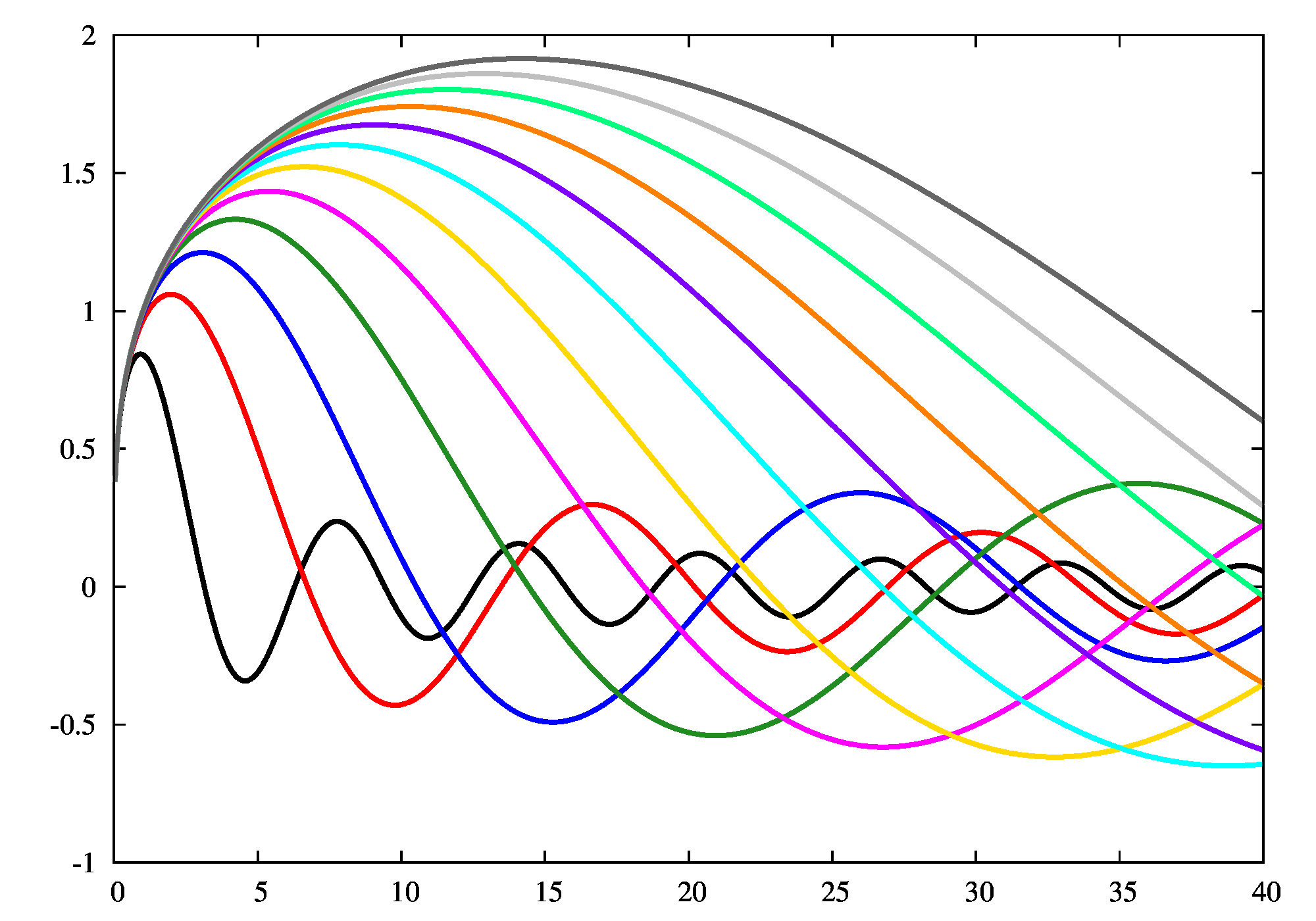
set linetype 1 lc rgb "black" lw 1
set linetype 2 lc rgb "red" lw 1
set linetype 3 lc rgb "blue" lw 1
set linetype 4 lc rgb "forest-green"
set linetype 5 lc rgb "magenta" lw 1
set linetype 6 lc rgb "#FFD900" lw 1
set linetype 7 lc rgb "cyan" lw 1
set linetype 8 lc rgb "#7F00FF" lw 1
set linetype 9 lc rgb "#FF7F00" lw 1
set linetype 10 lc rgb "#00FF7F" lw 1
set linetype 11 lc rgb "gray" lw 1
set linetype 12 lc rgb "gray40" lw 1
上の設定を適応すると、カラーマップはjetに黒を追加したもの、線は以下のようになります。
配色のあれこれ、gnuplot demoより。
カラフルに塗りたい http://gnuplot.sourceforge.net/demo/pm3dcolors.html
モノクロに塗りたい http://gnuplot.sourceforge.net/demo/pm3dgamma.html
点に色をつけたい http://gnuplot.sourceforge.net/demo/rgb_variable.html
線に色をつけたい http://gnuplot.sourceforge.net/demo/rainbow.html
http://ayapin-film.sakura.ne.jp/Gnuplot/Primer/Misc/colormap.html
[1]D. A. Green(2011), ‘A colour scheme for the display of astronomical intensity images’, Bulletin of the Astronomical Society of India, 39, 289.(2011BASI…39..289G at ADS.)
またDave Green’s `cubehelix’ colour schemeをご覧下さい。
[adsense2]
